At present no way can the web even suggest the splendor of canvas-based art masterworks. To elucidate let me make use of Mark Harden's Artchive. First I'll vector you to one of the exhibitions at the Artchive. Click here. Now click here for the painting I've chosen from the exhibition to make my point. On the page we just opened containing Rembrandt's Portrait of the Artist at His Easel, click on zoom, then on the page that opens click either on Rembrandt's painting or the words "Image Viewer." The enlarged image before you (or for that matter the smaller version of Rembrandt's painting on the previous page), is this what Rembrandt had in mind? Scarcely. Is it what Portrait of the Artist at His Easel looks like hanging on the wall of the Louvre? Of course not; yet the problem far transcends Mark Harden's Artchive, a superb website I enjoy visiting for its highly useful biographical information on artists, as well as its fine theory and criticism pages. The problem is pervasive, consuming the entire web, where artwork scans in general possess that same washed-out, diluted look. It all comes down to derezzing as a result of compression software: i.e., sacrificing image quality for quick-loading webpages. Will the situation change in future as web compression software becomes more sophisticated? Certainly. But who knows when? Web entrepreneurs who crashed and burned in the late 1990s found out only too well how dangerous it was to overestimate the rate at which the web would evolve.
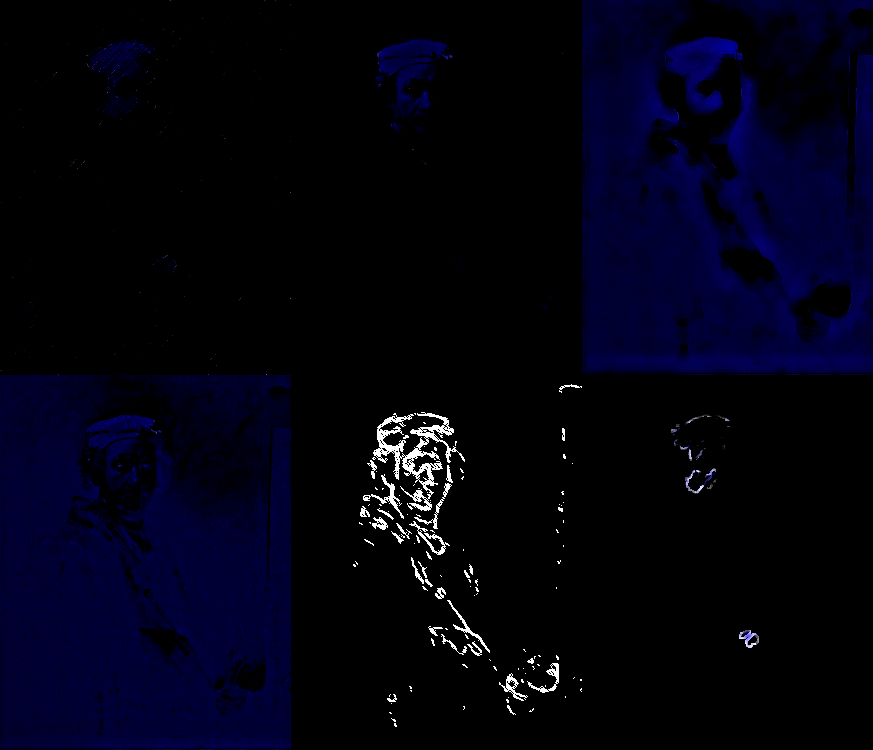
However, with artworks created specifically for the web, I do believe they must harness the web's low-rez ambience, as my animation running below attempts to do:

Sampled from the scan of Portrait of the Artist at His Easel on Mark Harden's Artchive, I call the piece Neon Rembrandt, and it is meant to illustrate just how raw a medium the web remains - visually much closer to garish neon light than subtle moonlight. The trick is to find beauty within its very starkness.
© 2004 Peter Schmideg